With clear, distinctive extensions into the more premium and more value-focused tiers above and below it, defining the core Pam brand acquired greater importance.
A new packaging design system was established to communicate affordability, quality and functionality across a diverse range of products and formats, while making it easy for consumers to find Pams products in the supermarket regardless of category.
The system has to be flexible yet simple and easy to adhere to, benefiting compliance and consistency.
Our solution was built around three pivotal aspects: photography, shape and colour.
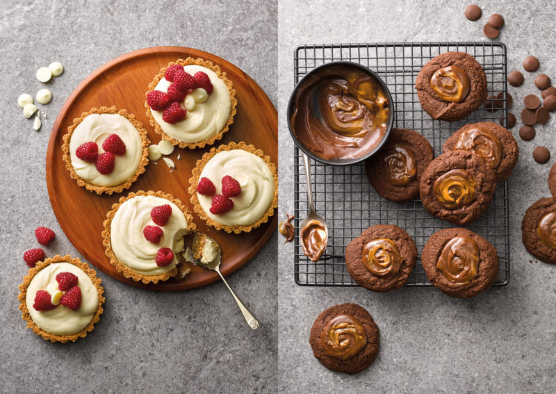
Photography is key to telling the ‘story’ and creating an emotive, inspirational idea of how the product can be used. So imagery shows delicious, mouth-watering serving ideas, shot from above in a relaxed at-home setting.
Meanwhile, a consistent white tab device holds the naming lock-up, flavour description and support icons, while the colour of the type matches and complements the photography.
Arriving at a workable Pams design system has not only aided consistency for the brand, building consumer trust and confidence. It has also increased the ability to add new lines and enter new sectors with unprecedented cost and time efficiencies.

