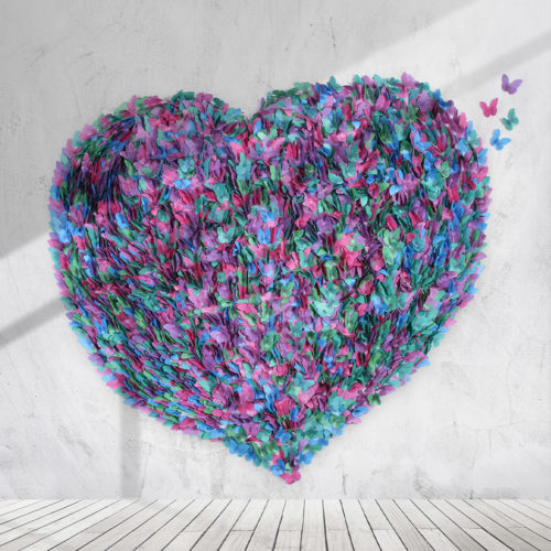
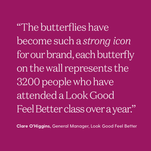
We began with a brand mapping process that detailed Look Good Feel Better’s core story, values, personality and voice. This led us to the ‘butterfly’ symbol, emblematic of physical and emotional transformation.
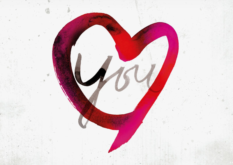
Working with renowned Swedish artist Stina Persson, we created hand scripted type and a series of watercolour illustrations to convey the emotive and uplifting experiences of the workshops.
Our design approach made the brand look more contemporary but also very caring. The communication task was to show that the charity is about more than ‘wigs and make-up’, that it can genuinely transform people’s lives. So we used real-life stories of cancer patients Look Good Feel Better had helped, focusing on the experience and how it changed the way people feel for the better.
The results were amazing. The annual ‘Feel Better’ week after the implementation of the new brand development was Look Good Feel Better’s most successful ever, with fundraising exceeding all expectations.


