From Christmas hams to sausages, continental meats to good old-fashioned bacon, Leonard’s operates in some of New Zealand’s most competitive sectors. The quality of their products was second to none, but the brand felt dated and was not living up to the products’ potential.
Our research revealed a number of insights. The first was that Leonard’s proud history, while reassuring, would not be enough to stand out on its own. Similarly, the NZ-family owned aspect was valuable but not a trump card amidst many brands proclaiming NZ heritage. What was ripe for improvement was the brand’s capacity to stand out, requiring a bold, single-minded approach.
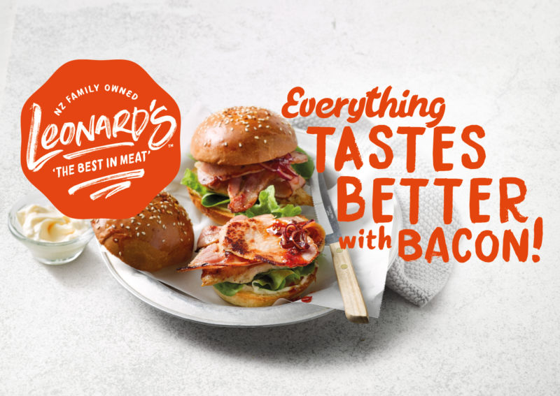
Our strategy hinged on amplifying the quality aspect of the Leonard’s range. Bringing the brand name up in size underlined a sense of pride, while an ownable logo shape–with the look of an award stamp–helped reflect the brand’s prize-winning heritage.
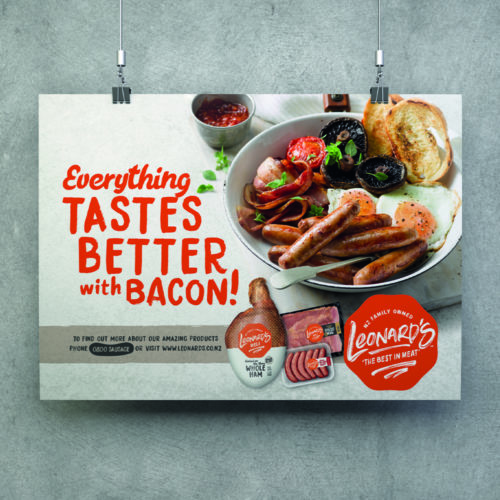
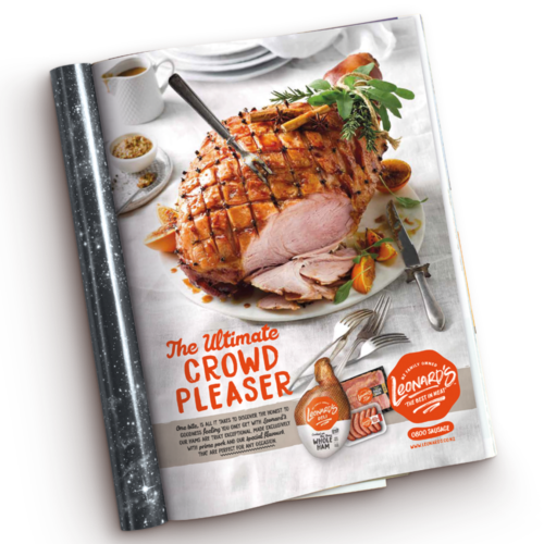
We also developed the brand’s communication inventory, with a look that worked across multiple formats and products, with and without photography.
The new logo and pack designs added much-needed contemporaneity, and new photography brought mouth-watering taste appeal. Meanwhile, the new communications programme was rolled out with a campaign that brought a cheeky sense of self-confidence to the brand. As the new brand owners, Robert and Elizabeth Bell, succinctly put it: “We’re a multi-award-winning butcher, and now we look like one.”
