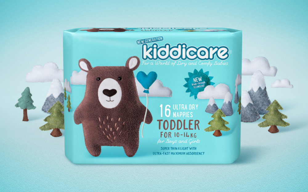
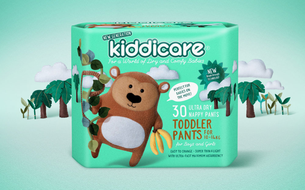
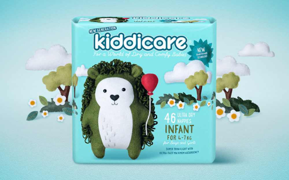
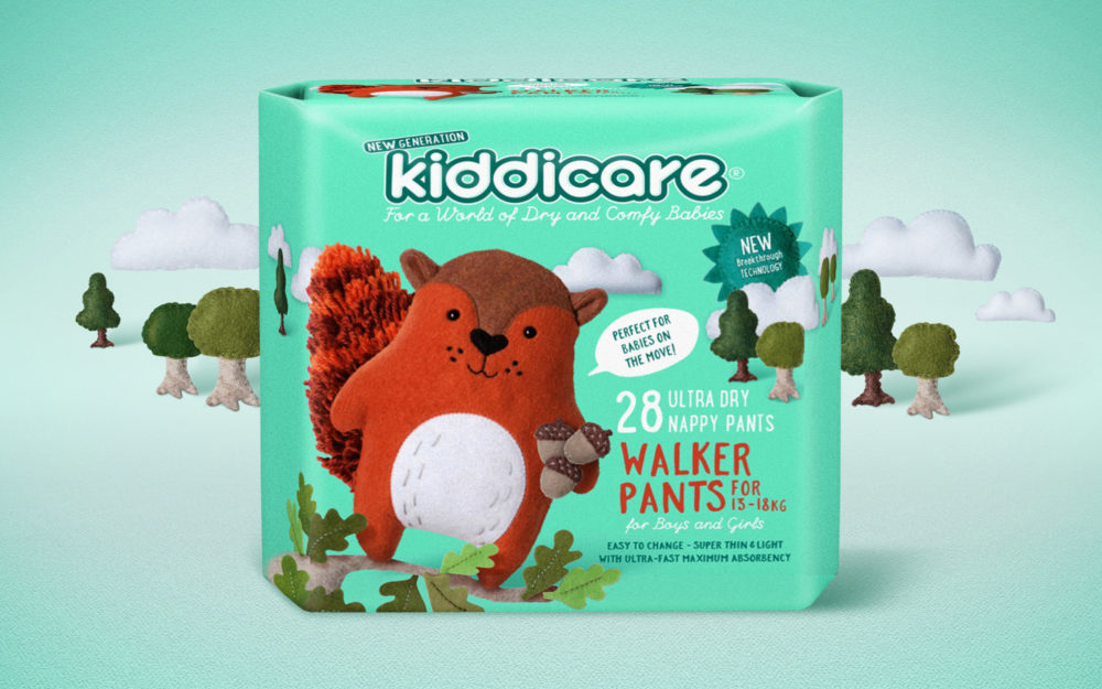
If you want the definition of a challenger brand, Kiddicare is it. They were entering a market dominated by well-known global names in a product area where trust is everything. What they had on their side was technology. Zeta group had invested a lot in developing a genuinely better nappy and, once used, parents really appreciated the difference. But getting noticed and winning trial wasn’t going to be easy.
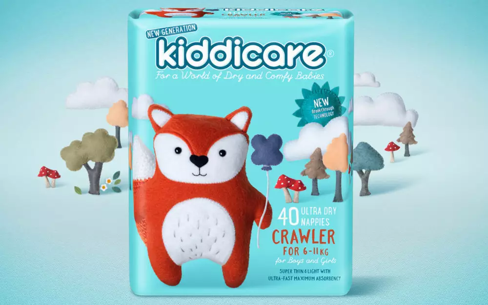
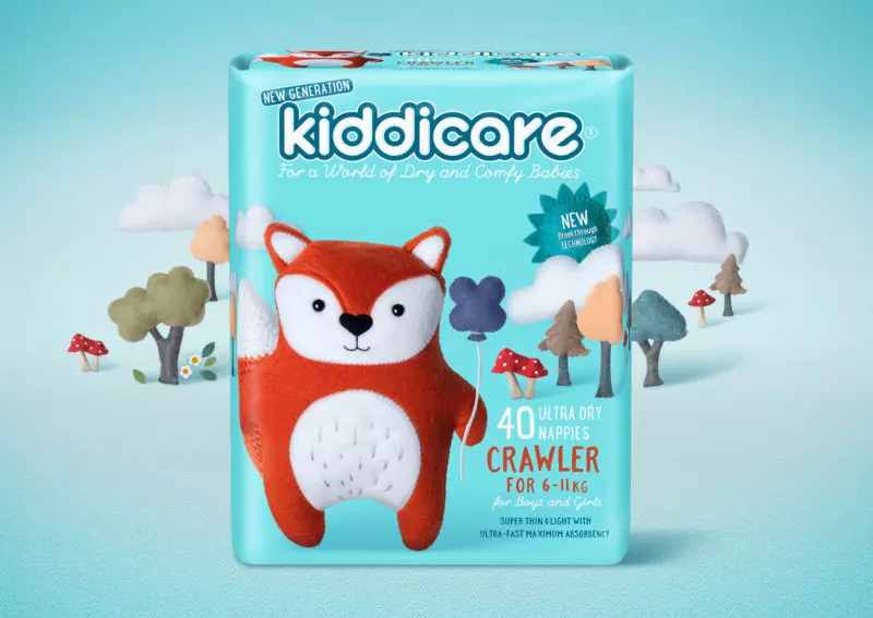
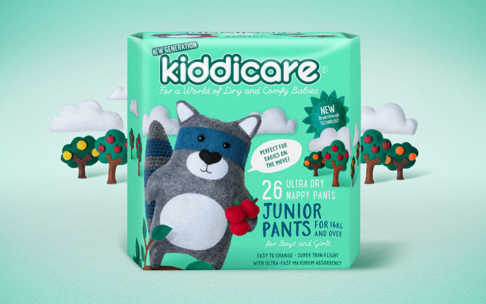
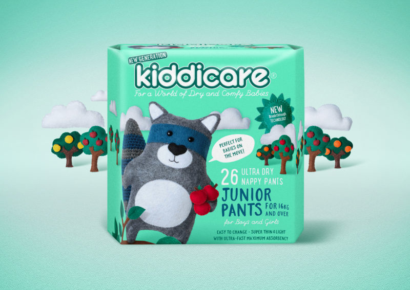
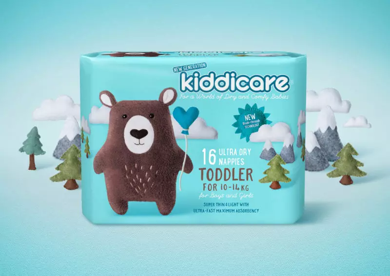
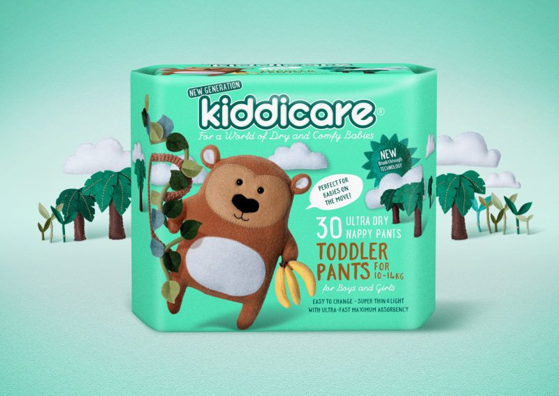
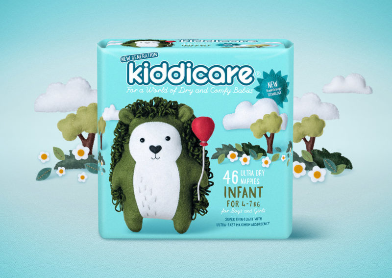
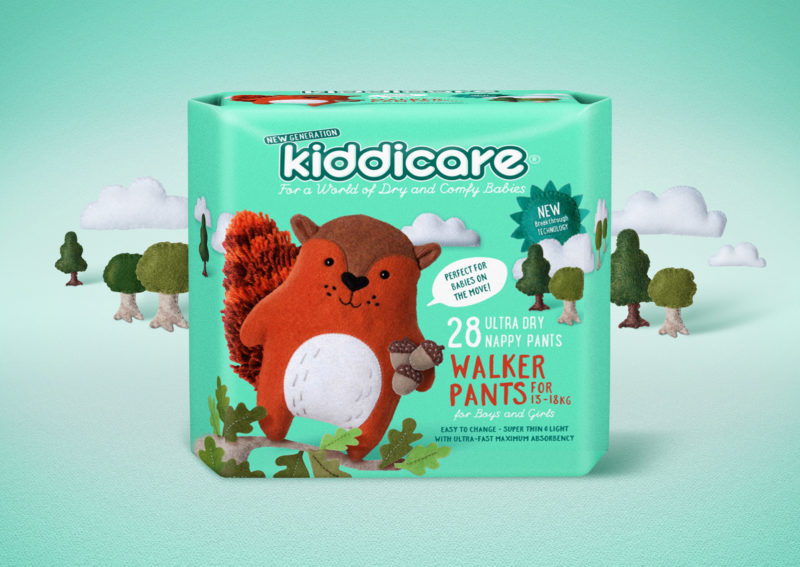
Our thinking was influenced by the authentic difference in the way Kiddicare nappies performed. We came up with the idea of creating real characters, as though taken from the pages of a child’s storybook. Rather than cartoons we had actual toys hand made out of felt and other craft materials by artist Kim Edwards-Seuseu. The result was a family of cute, cuddly animal characters set in their own storybook-like scenes.
Not only did these form the basis for standout packaging, they offered an amazing platform for promotions, ranging from animated stories to collectible toys. They appear on the Kiddicare website and even have a presence on Facebook.
The approach gave the brand irresistible charm and personality, making the packaging an instant hit with award judges. It was a finalist in the Best Awards 2017 for Packaging, taking out Gold in the Design Craft category. As one of the judges put it: “A really fresh take on illustration. In an age of Photoshop and computer rendering this is real and authentic.”
