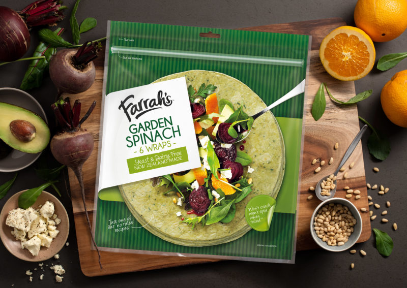
Although Farrah’s led the flatbread category the sector was exploding with new entrants. If Farrah’s was going to do well in this market, it would have to stand out and grab people by the tastebuds.
Our solution was inspired by two observations. One, that being able to see the actual product bred trust and feelings of authenticity. And two, consumers are always seeking ‘easy inspiration’ when shopping, often making purchase decisions at the last second.
We came up with a design that featured exquisite food styling and photography overlaid on a see-through window showing the wrap inside. This acted as a ‘visual recipe’ while making the results look realistic and achievable. A great idea, but technically very challenging.
It took a real team effort between ourselves, the food stylist, the photographer and the packaging printers, but the end result was sensational. Reaction from the grocery trade was immediate and remarkable. They loved the new look, and could immediately see how it would inspire consumers and boost sales.
So it proved. Farrah’s not only retained market leadership, it increased share, achieving the highest loyalty and repeat purchase scores in the category.
Meanwhile, the design took out the Pride in Print Supreme award in 2015 and was a finalist in that year’s Best awards. Extensions to the range in 2018 saw Farrah’s again triumph as Supreme winner at the Pride in Print awards.

