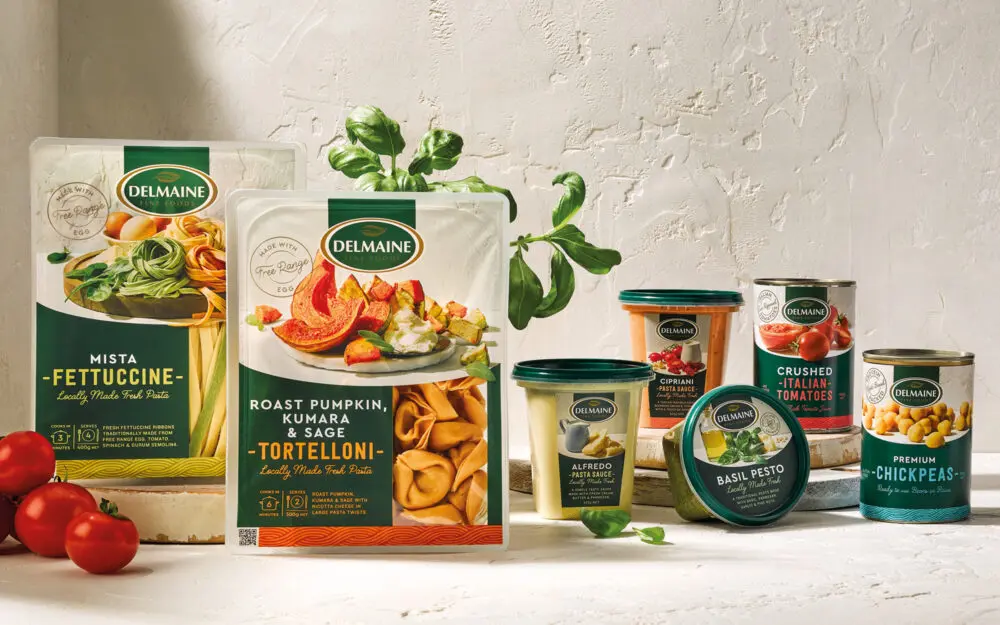
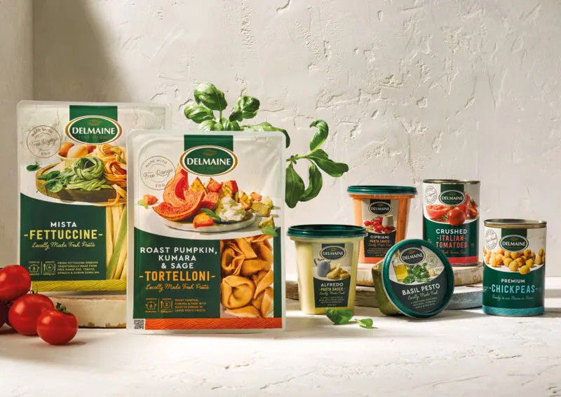
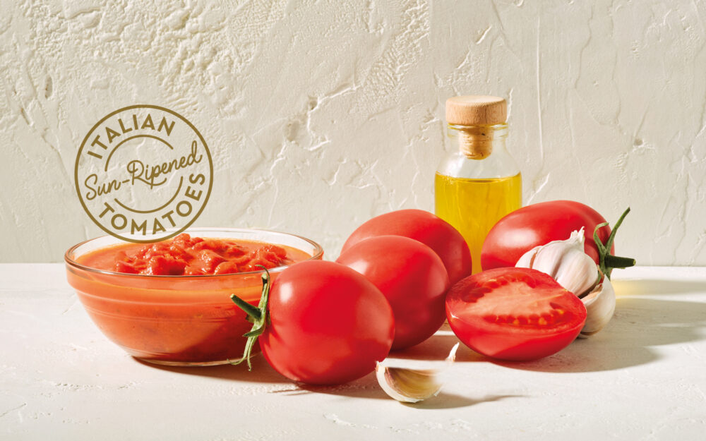
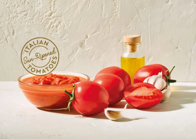
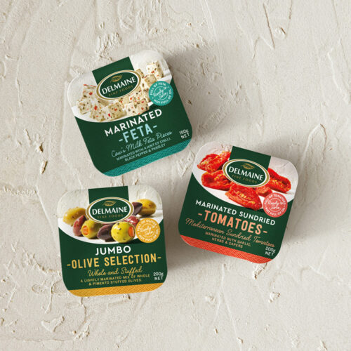
In response, we embarked on a journey marked by boldness and simplicity. Our aim was clear: to command attention on every shelf, in every format, both big and small. We endeavoured to capture the essence of taste through a distinctive photographic style. Against bespoke plastered backgrounds, we showcased mouth-watering ingredients and tantalizing serving suggestions, basking in the glow of simulated Mediterranean sunlight. Each pack became a canvas where ingredients seemed to tumble out of the scene, inviting the consumer into a world of culinary delight.
Rooted in Delmaine’s rich heritage, we incorporated visual cues representing the origins of our ingredients. Vibrant patterns, each a nod to the sourcing locations, adorned our packaging, while a gold stamp proudly declared the provenance of the products. Throughout this transformation, we maintained the iconic Delmaine dark green, punctuated with touches of gold, forging a visual link to the past.
With a refined treatment of the Delmaine logo, we ensured it stood as a beacon of quality atop the packs, no longer lost amidst the hustle of the shelf. Clear, concise naming and a strategic information hierarchy made the shopping experience seamless for consumers, guiding them effortlessly to their desired products.
Today, Delmaine’s Mediterranean-inspired ranges stand united on the shelves, exuding a cohesive and unmistakable presence. Each pack tells a story of origin
and quality ingredients—a testament to the unwavering commitment to delighting taste buds.
