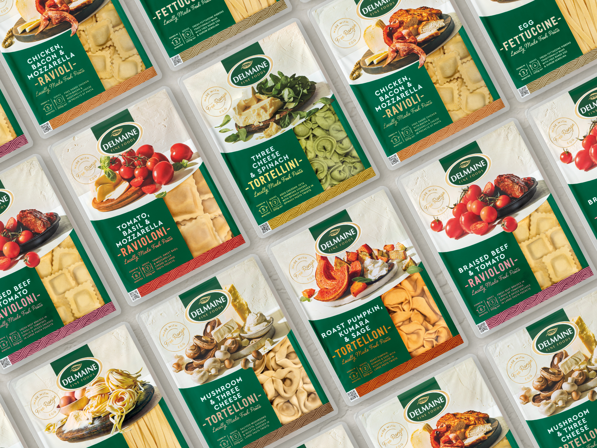

Delmaine’s Mediterranean-inspired range is a familiar sight in retail stores up and down the country. Now it’s set to gain a fresh new look, thanks to packaging design specialists Brother Design. “Delmaine has always been known for its great products and has a strong reputation in the pasta and sauces categories,” says Jenny McMillan, Business Development Director at Brother Design. “The challenge was that, as the range expanded, it wasn’t easy to maintain a cohesive look. So, with a significant new investment in plant and new products coming up, Delmaine asked us to review and update the design across the range.”
According to Brother’s Design Director, Debbie Hyde, the new look retains familiar cues that have long identified Delmaine in store, adding greater focus on the quality ingredients. “Stylish food photography has given the taste appeal a real lift,” says Hyde. “At the same time, the new designs are instantly recognisable as Delmaine. It’s such an iconic brand in these categories and it was a real pleasure to work on something so treasured by New Zealand shoppers.”
The new designs also cover new products and formats, with Delmaine’s biggest ever communications push set to promote the range. So whether in store or in the media, consumers are going to notice something very new about Delmaine.
Check out the article in FMCG here.