From the start, our focus was clear: connect with the 18-24 market through bold visuals and playful energy.
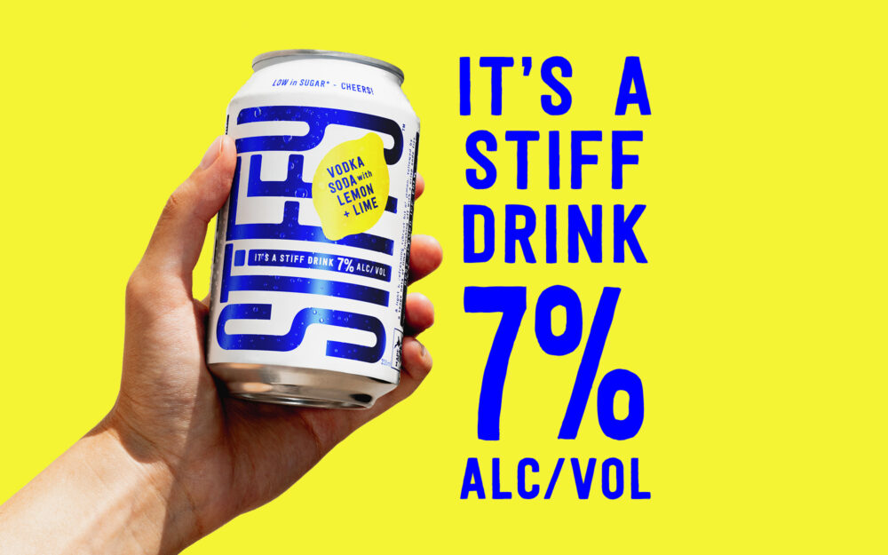
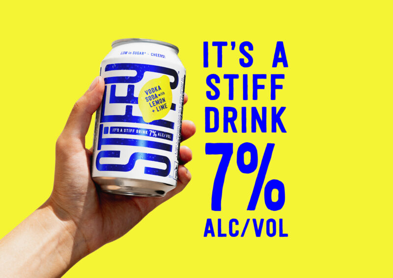
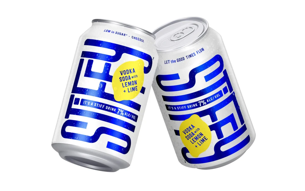
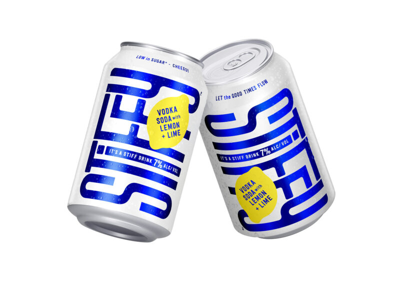
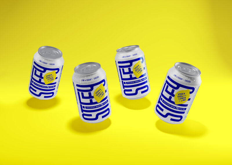
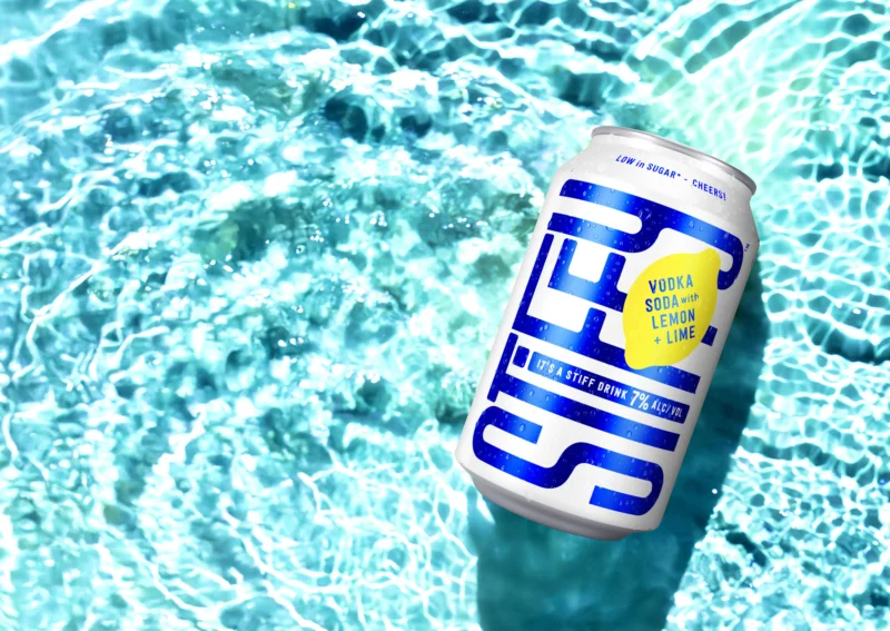
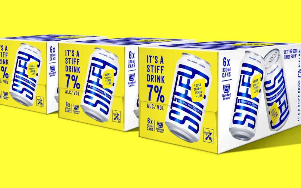
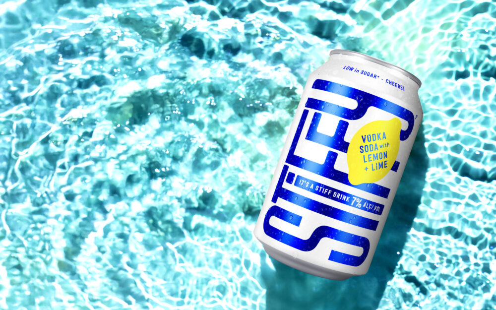
We led with the name – playful, provocative, and full of character – making it the centrepiece of the can. Interlocking letterforms represent connection and good times, while a high-contrast colour palette – electric blue, crisp white, matter silver, and lemon yellow ensures instant shelf impact.
Print finishes elevate the experience: a matte base contrasts with gloss-highlighted branding and a transparent electric blue overlay for a subtle, premium shimmer. Double-sided branding ensures visibility no matter how it’s held.
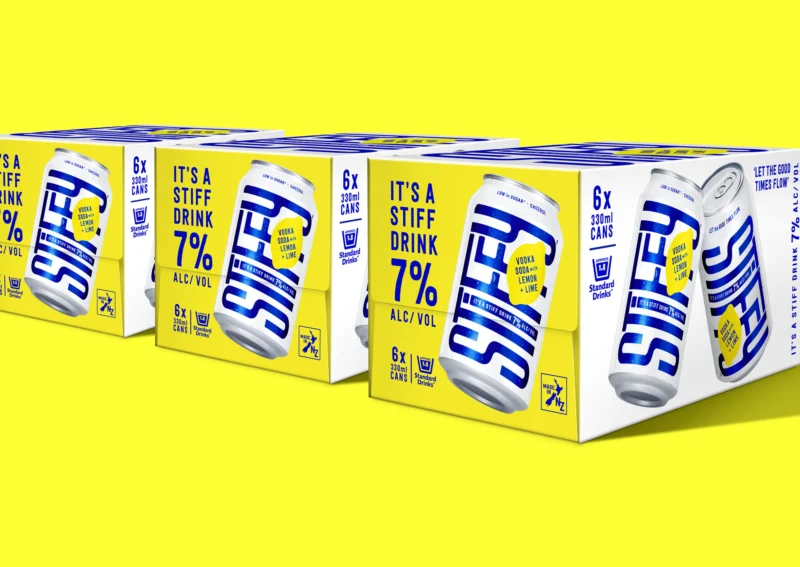
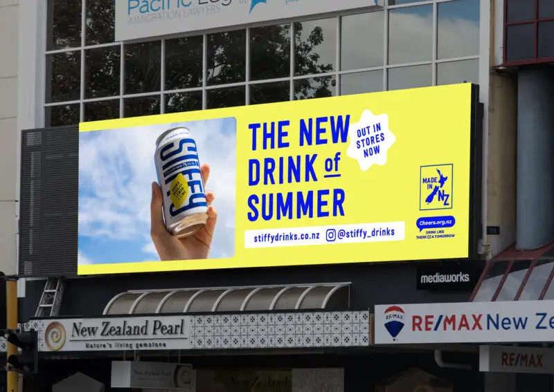
With crowded chillers, our packaging had to work twice as hard to grab attention. So we created a mini billboard effect on the case ends – bright yellow with the bold tagline, “It’s a stiff Drink, 7% alc/vol,” alongside a large product visual, making it impossible to miss.
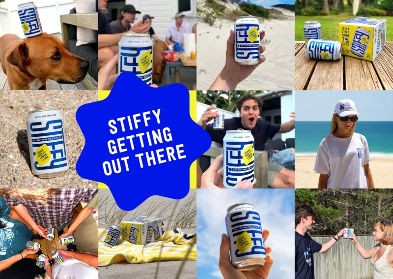
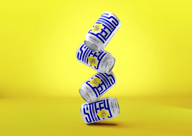
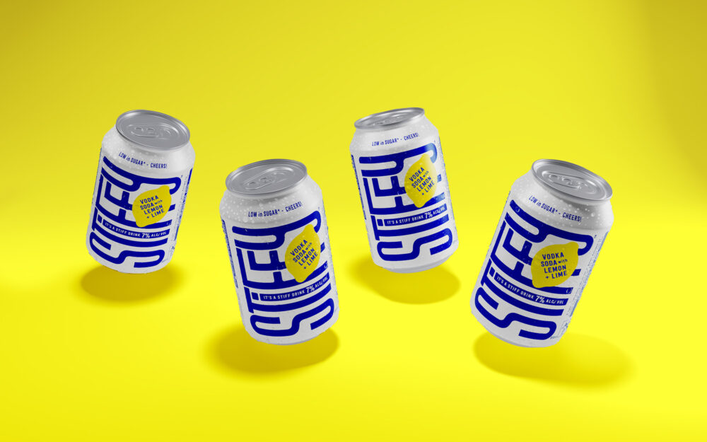
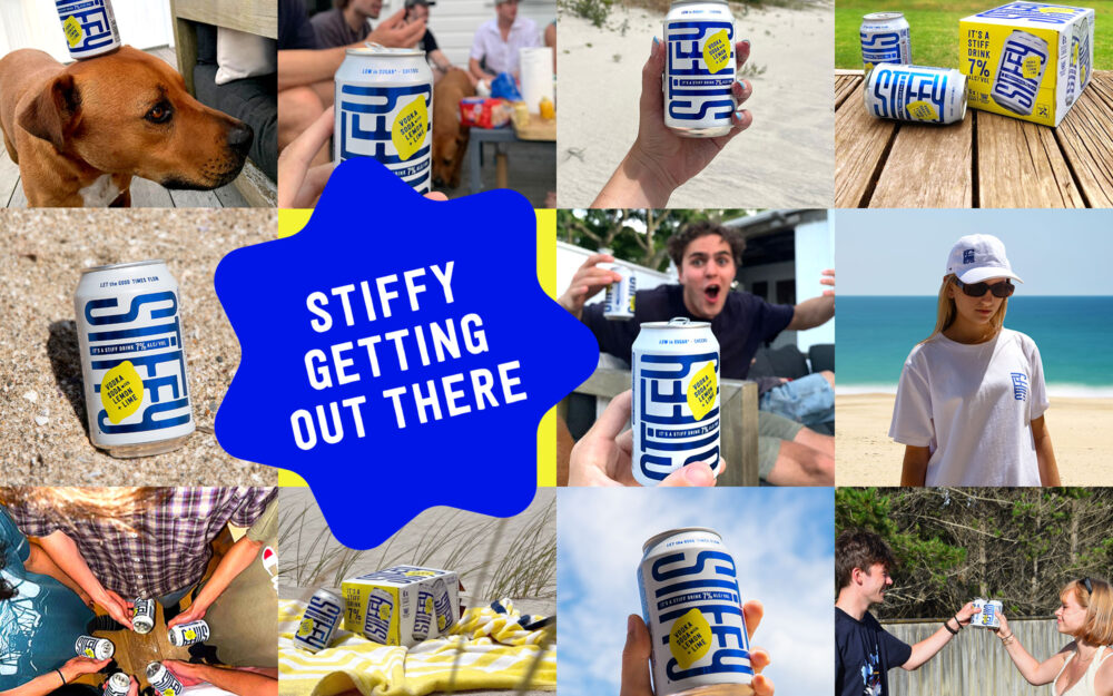
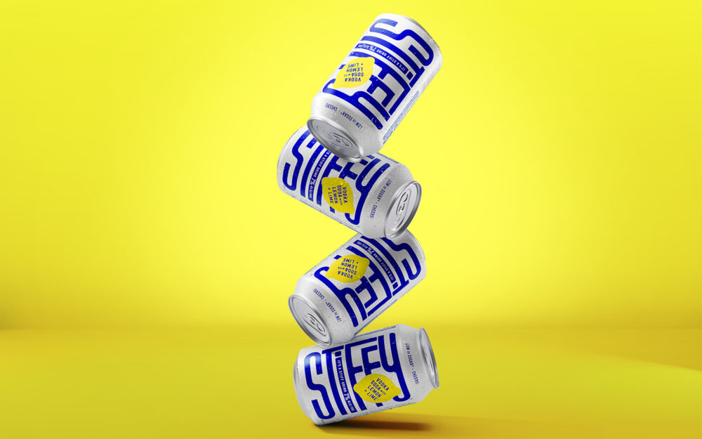
The energy of Stiffy extends beyond the can. Every visual was designed to capture a fun, playful, and rebellious spirit. Product imagery is never static – cans are always angled, exuding motion and attitude, a series of lively animations personify the cans, bringing them to life at parties, set to our unique Stiffy soundtrack and strong, memorable messaging reinforces the brand’s confident, cheeky persona.
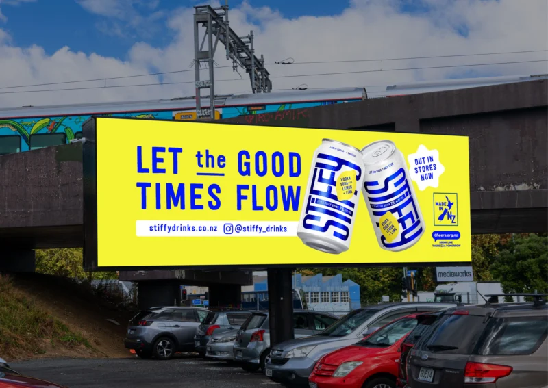
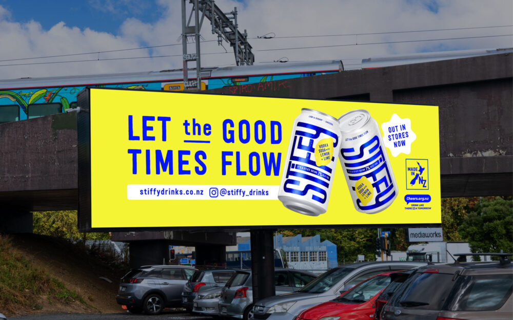
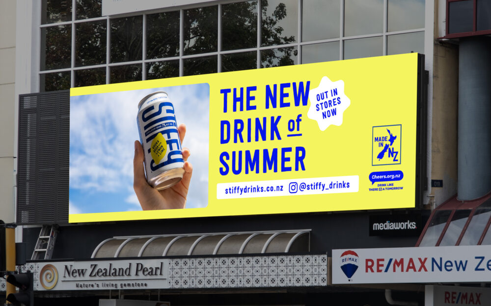
Beyond the packaging, we’ve crafted a fully immersive brand experience, including: Website, Social Media Playbook, Animated Campaigns, Merchandise, Launch Materials, & Billboards.
Talkable, fun, and impossible to ignore – Stiffy has already sparked all the right conversations.
Here’s to making waves and shaking up the game. Cheers to that!