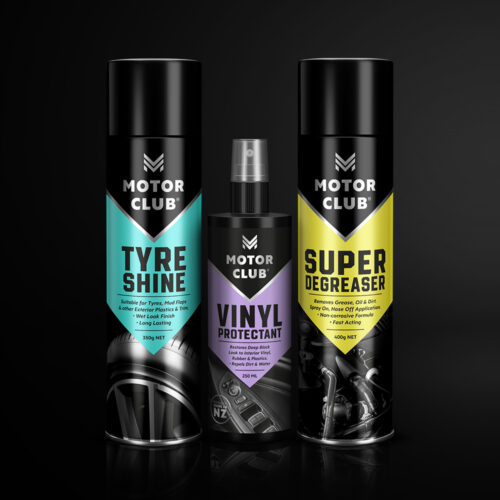
We explored many names looking for one that felt inclusive, trusted and showed the passion people have for their car – the name ‘Motor Club’ and the thought of ‘Where Car Lovers Unite’ ticked all the boxes.
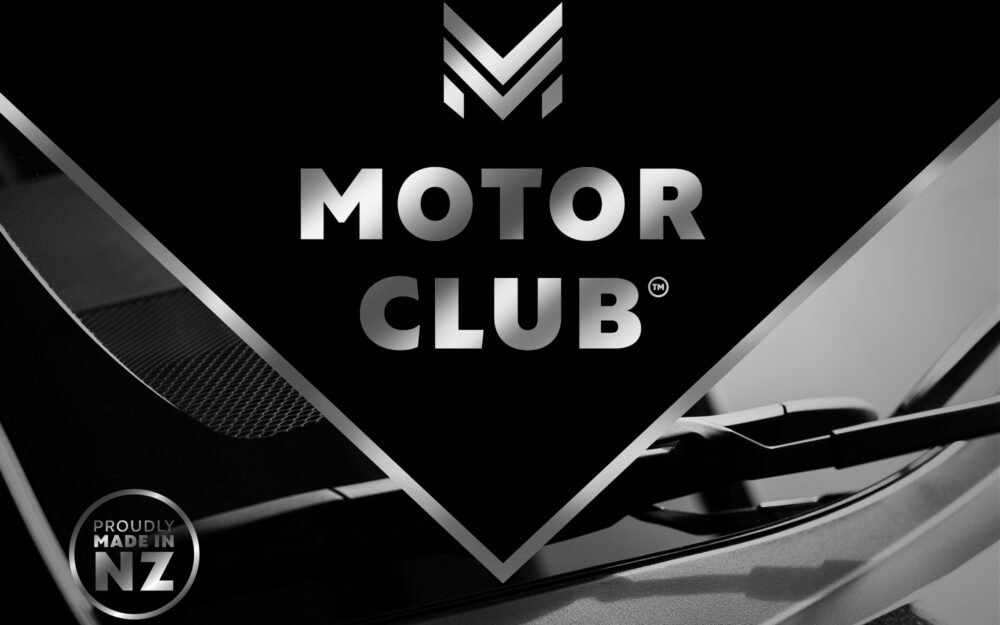
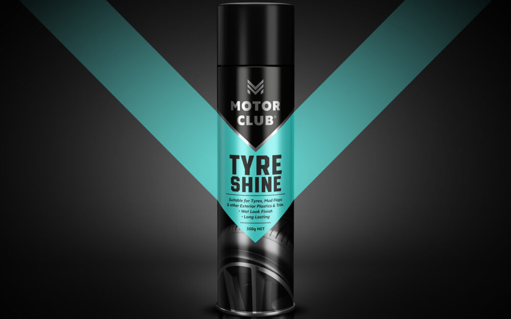
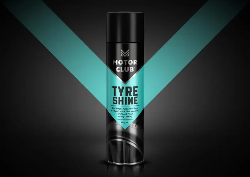
For the Logo we created a mark that had the feel of a car badge, this we produced in a chrome finish to look clean & shiny and produce punch on shelf. The use of a strong and graphic chevron shape created an unmistakable brand look. Choosing black bottles and cans creates a strong look, with the use of black, chrome and a palette of pastel colours the packaging is like no other on shelf. Graphic black and white imagery was added to each product to highlight what car part the product was for and particular attention was paid to the pack hierarchy with large product names in bold and chunky type and easy to ready bullet points and call outs making it easy for consumers to shop.
Extra touches were added to create a quality feel; matt finish on the labels and areas of chrome coming through in the imagery.
The results – a brand new brand that looks so trustworthy you would think it’s been around for years.
